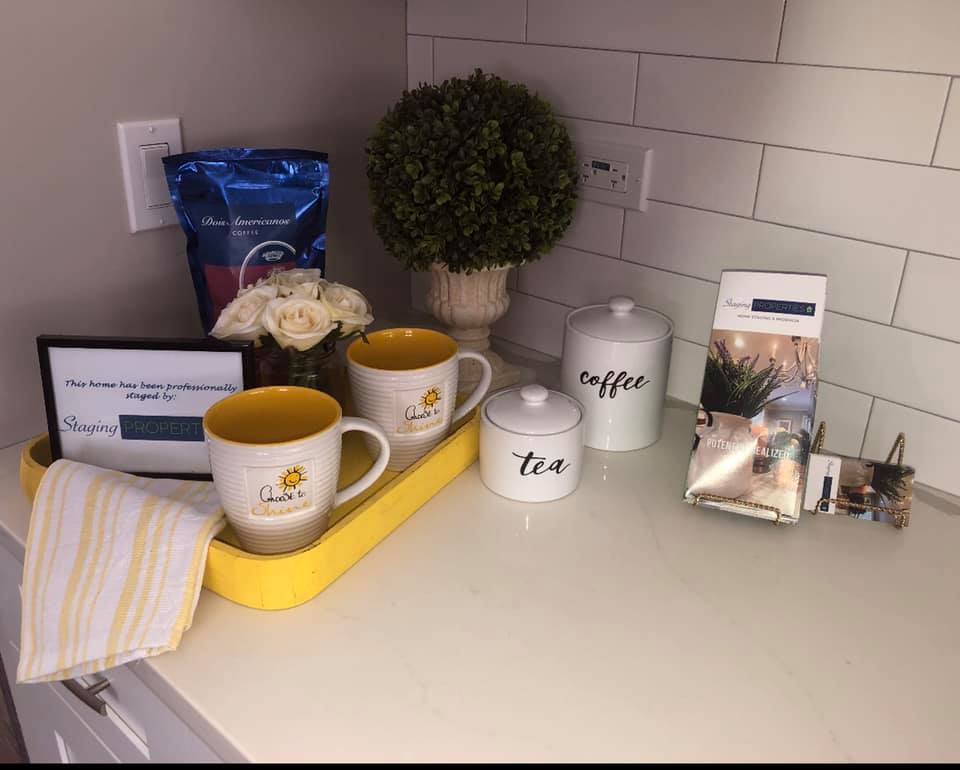
Home Stagers have such a uniquely cool business model because each job they complete becomes an instant marketing referral source for their business IF the stager brands it well. This is just one of the many reasons I always say that staging is a better business model than interior design.
In my HSR home staging Certification training I talk about the importance of leaving your mark, so that the home buyer knows that the home has been carefully prepped and curated for their arrival.
In our Facebook Stagers Connect private home stager group we collaborated on the unique ways we "leave our business mark" in the homes we stage and I thought it would make for a wonderful post to inspire others in their stager branding and marketing....enjoy!
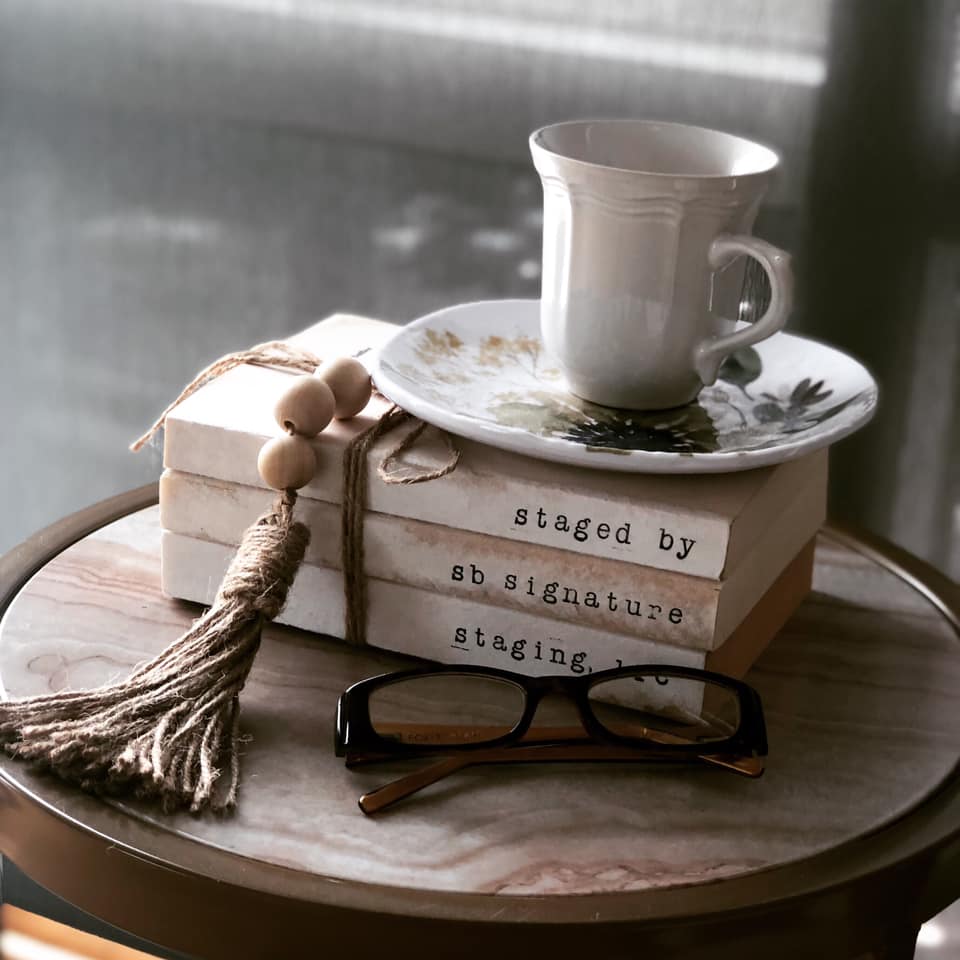
Shirley Borloz of Signature Staging in Nashville, TN cleverly adds her business name and information in a stack of books vignette....how cool is this?
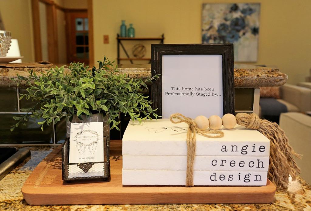
Angie Creech Design used a different variation on that the book stack by adding a frame behind it and layering it over a cutting board with her business cards.
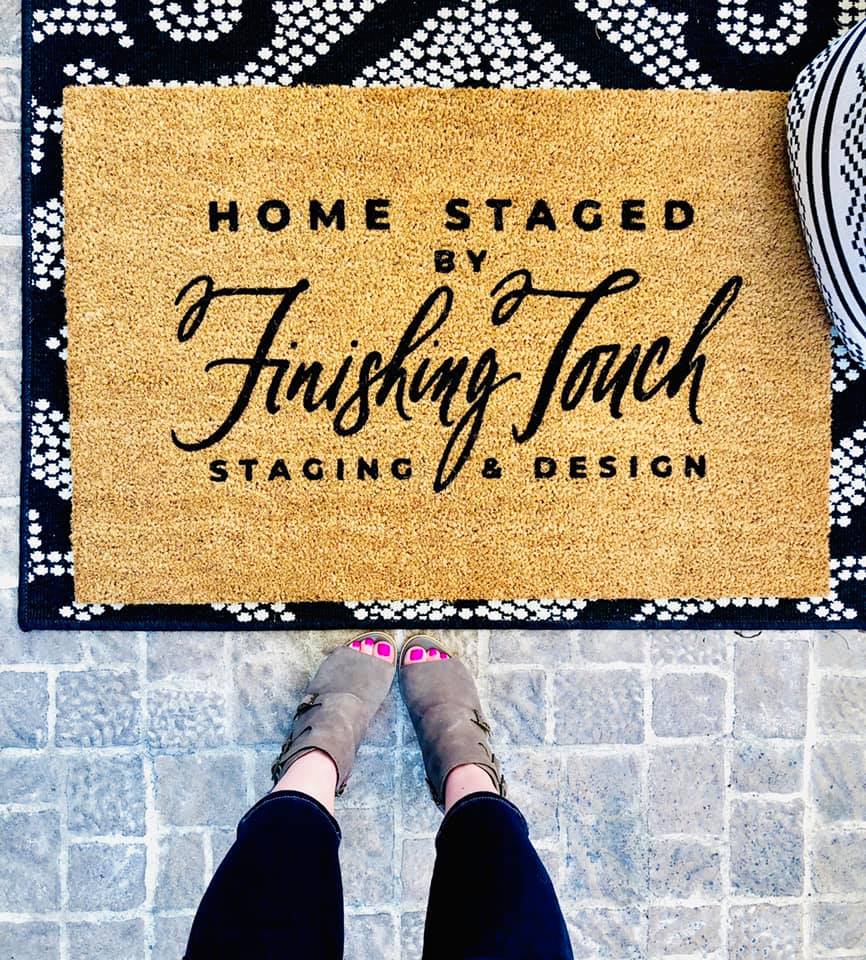
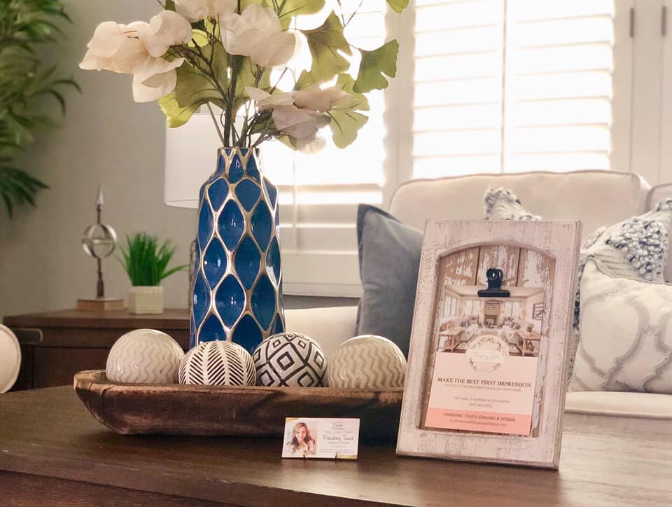
Sarah Williams of Finishing Touch Design out of Redlands, CA creatively leaves her mark in a couple places in the home. Starting with the front entry, she has a custom door mat with her business name and will then place her business cards and marketing postcard on a table in the home...
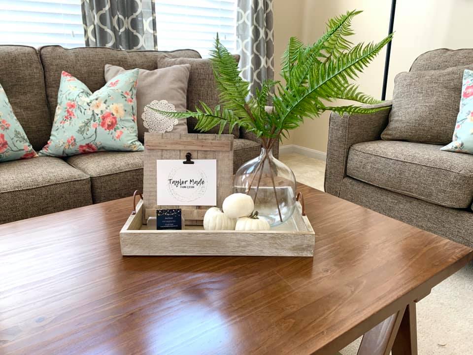
Dani Powers of Taylor Made Staging and Design varies her calling card vignette by season...below she has a fall centerpiece with her cute signage and business cards.
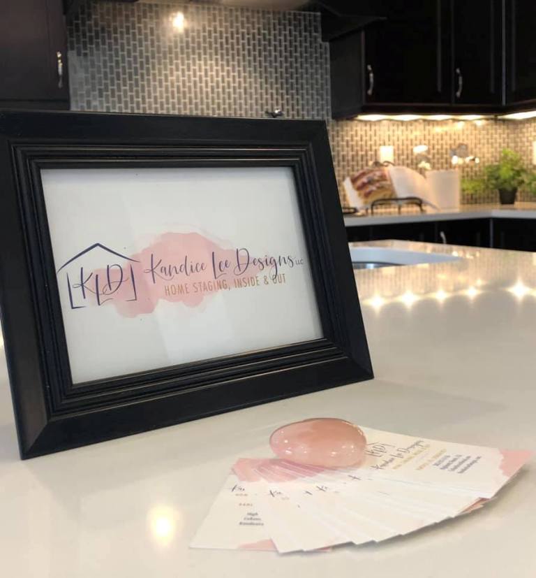
Kandice Lee Designs, a home stager out of Denver CO said that since she leaves a peice of her heart in every home she touches, her signature item is a pink heart shaped stone on her business cards to show buyers the love that went into that space...very clever!
Melissa Raab Mendelson, a home stager in the Chicago Area goes one step further by creating an eye catching vignette and adding her calling card, framed postcard with brochures and business cards.
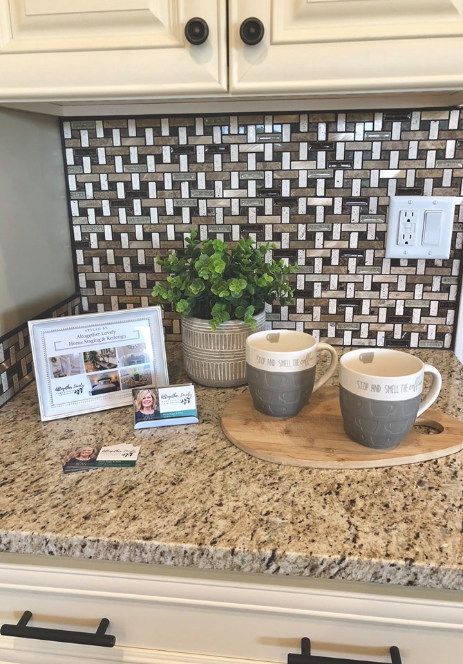
Sarah Beam of Altogether Lovely keeps is simple but adorable on the kitchen counter. I also like how she includes her photo on her business cards to make her staging and branding that much more memorable and personal.
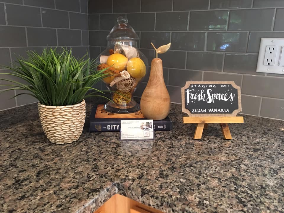
Susan Vaneria of Fresh Spaces out of Hartford, CT also uses the kitchen counter with a cute printable chalkboard of her business name and stack of cards.
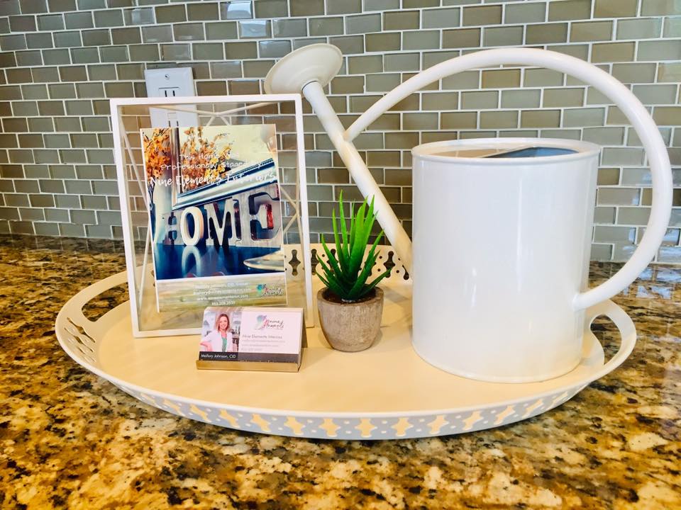
Mallory Johnson of Nine Elements Interiors out of Twin Cities changes up her approach depending on the home and here she uses a tray vignette that can be moved strategically to different locations in the home. Again, she's very smart to have a photo on the business card which again personalizes her brand to her prospective clients...
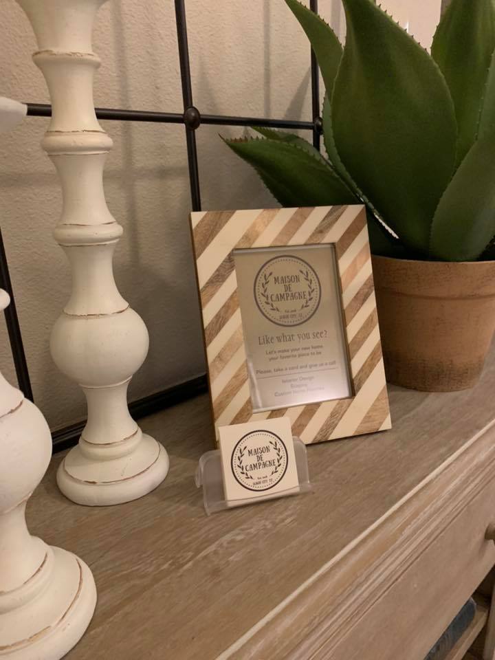
Mitch Bage of Maison De Campagne a home staging company in League City, TX uses a more subtle approach but I kind of love it...
I hope these different marketing calling card ideas inspired you in your own business! We are "creatives", so it's always exciting to see how each person manifests their creative branding in a home.
XOXO-Happy Staging
Audra
