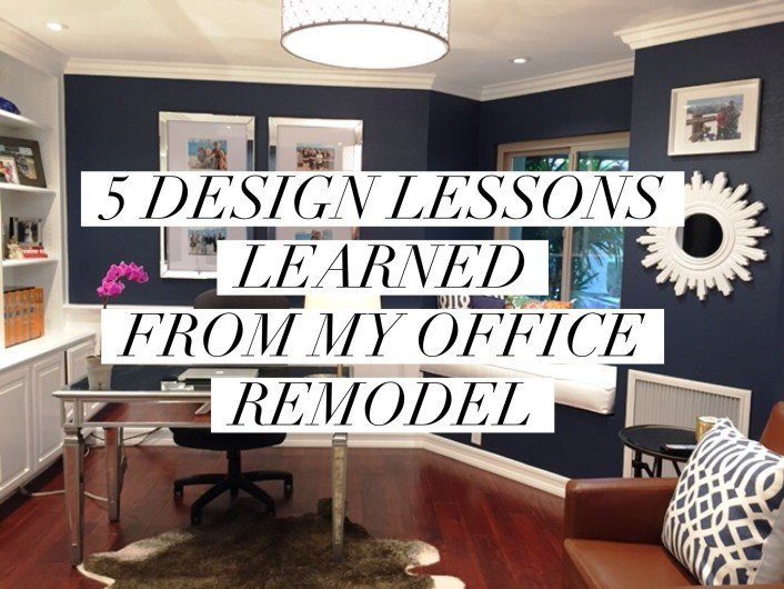
My Office Remodel - 5 Design Lessons Learned
Have you ever known that you have to do something with a space but feel a bit stumped?
I shouldn't have shown you the "after photo" so soon because once you scroll and see the before photos, you will see why this room was the bane of my home's existence! I did NOT want this ugly room as my office but since my kids were sharing a bedroom and turning into teenagers...it was time to remodel. Keep in mind, these photos were taken with my camera and not a professional.
Here are five lessons I learned from my office remodel...
1. You Cannot Make a Dark Space Lighter with Paint!
Office BEFORE
This room inside of my house was a constant, nagging irritation to me because I had no idea what to do with it! First off, it's SUPER dark and gets very little natural light. In fact, there is just the one little window that emits no light and the doorway in which I am standing to take the photo is the only light source...soon to become a door. In the past, we attempted to paint the room my favorite brightening color from the Benjamin Moore Affinity Deck called Jicama but it looked drab in this space...thus lesson #1.
Office AFTER
To combat the darkness, I added lots of artificial lighting in all of it's forms, lots of bling from the mirrored desk, mirrored frames, table and gold lamp in order to brighten it up. The key to dark spaces is to embrace them with paint and rely on artificial lighting to do the rest. Embraced the darkness I did with Benjamin Moore's Historical Collection, Newburyport Blue HC-155 which is the ignored color next to the very popular Hale Navy. It's a warmer navy than Hale Navy without looking too blueberryish like Van Deusen Blue.
2. You Have to Splurge When You LOVE Something Sometimes:)
BEFORE
The window seat was begging for something and since you already know that I am a HUGE pillow lover, I felt it was time for me to splurge on some of my favorite Schumacher fabrics even though I have kids and animals that have NO respect for my furnishings...alas!
Splurging is hard for me since I am very practical but splurge I did on each one of these pillow (even though I got them wholesale), knowing they would probably have a lifespan of a year in my house.
3. You Have to be Practical When It Comes to Your Comfort
My office chair is the ugliest thing ever and I'm sure you noticed it right away my stager/designer readers! But here's the thing, I have to sit there for many hours everyday and do my job, so I have to be comfortable. Have you ever looked at rooms in magazines and asked yourself whether you would FEEL comfortable there? We are staging and designing for real people in real situations, so comfort and practicality does matter.
The little brown, leather chair is a comfortable, recliner that I do use quite often at night to watch the TV in this room...who can ever agree with their husband on TV viewing preferences?
4. You Have to Get Personal
I'm one of the few staging trainers who believes your "lived in" home should NOT look staged. I have family photos everywhere in my home, as well as kids artwork and awards on display. Even in my new office you can see that I have a wall of my boys artwork and a mirror-framed, wall of my latest family photos taken on the beach in Cabo San Lucas, Mexico.
5. Adding ANY Kind of Architectural Element Will Boost the Space
I was on a limited budget but wanted shelves for my MANY books and cabinets to hide my ugly, office "stuff". Here's another tip, make sure you are crystal clear on exactly how you want those cabinets built! I was armed with photos of both the mill work and cabinet I wanted, so this was easy and boy does it make a difference!
6. Animals LOVE Animal Skin Rugs Even If They Are Fake

